Ionic Cards are great way of sharing information in
organized and controlled way. Ionic cards act as complete set of part i.e. they
can have header, body and footer within themselves. Their mobile visual
representation works better with respect to user experience hence they are
quite popular in terms of use. Their design pattern fits perfectly along
new-age modern devices that many major brands use them in their daily routines.
 Below we have provided a sample on Ionic Card Example to begin
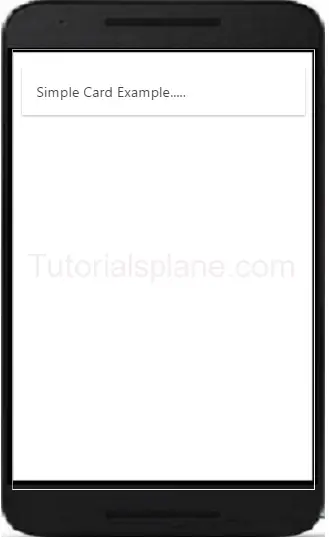
with you have the main div element with .card specific class with another child div having
classes of .item
and .item-text-wrap
respectively. And Output of that code follows below that which shows how it will
look in your mobile screens. They have CSS box shadow by default.
Below we have provided a sample on Ionic Card Example to begin
with you have the main div element with .card specific class with another child div having
classes of .item
and .item-text-wrap
respectively. And Output of that code follows below that which shows how it will
look in your mobile screens. They have CSS box shadow by default.
<div class="card">
<div class="item
item-text-wrap">
Simple Card Example.....
</div>
</div>
|
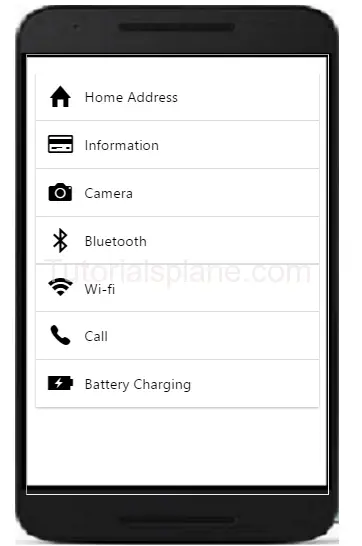 One of the main benefits of using these cards is their
flexibility as they can as page and can also be placed over one another. Also
they can be used for swipe functionality too i.e. swipe left and swipe right as
per given circumstances. Easily controlled, manageable and are animated to draw
user attention while they are going through the content of particular page. Headers and Footer can also be placed inside Ionic Cards
making it useful for all purpose functionality.
One of the main benefits of using these cards is their
flexibility as they can as page and can also be placed over one another. Also
they can be used for swipe functionality too i.e. swipe left and swipe right as
per given circumstances. Easily controlled, manageable and are animated to draw
user attention while they are going through the content of particular page. Headers and Footer can also be placed inside Ionic Cards
making it useful for all purpose functionality. 
Read more Ionic tutorials
with example step by step expert guidance only at our online web portal Tutorialsplane now!